|
sito + "/AREA=" + sezione + "/AAMSZ=" + misura + "/ACC_RANDOM=" + bumber + "/PAGEID=" + pageid + "'>");
document.write(" |
| home > allestimenti |
|
sito + "/AREA=" + sezione + "/AAMSZ=" + misura + "/ACC_RANDOM=" + bumber + "/PAGEID=" + pageid + "'>");
document.write(" |
| home > allestimenti |
| Topographies of Negotiation. Notes on ReD's Design Project for the M-City Exhibition ReD (Marta Malé-Alemany/Jose Pedro Sousa) |
||||
|
Kunsthaus Graz is hosting, until January 8th, the exhibit M
Stadt - European Cityscapes curated by Marco De Michelis (in collaboration
with Katrin Bucher and Peter Pakesch) which celebrates the topic of
the "city", seen as one of the most complex and yet most dynamic
phenomena in European civilization. The alien bubble designed by architects
Peter Cook and Colin Fournier along the banks of the river Mur hosts
a quite intensive and engaging exhibition design conceived by ReD |
Research + Design. This architecture and digital fabrication studio
is directed by Marta Malé-Alemany and José Pedro Sousa
who have both professional and academic experiences in Europe and in
the US, and whose works were recently featured as part of "The
Storytellers" exhibit within the BEYOND MEDIA festival. The two
architects present on the pages of ARCH'IT the immersive and intensive
exhibition design they produced in Graz, explaining how they intervened
within the intricate architectural context of the Kunsthaus, how they
dealt with the legacy of the building's experimental architects, how
they let the building itself provoke them. [PG] |
||||
 Kunsthaus Graz, Space 01 empty (photo by Lackner / Kunsthaus Graz). INTRODUCTION (1). When ReD was invited to design the 'M-City' exhibition for the Kunsthaus Graz (2), we quickly realized how challenging the project would be. The particular features of the space, together with the scale of the exhibition and the singularity of both its artistic contents and intellectual contributions, drew quite an intricate context for any architectural intervention. Essentially, it would be impossible to address this project without a critical reflection on these 3 topics, involving regular discussions with curators and other agents involved in the process of building up this exhibition. |
[06jan2006] | |||
THE KUNSTHAUS SPACE.
It is fair to say that the complexity of the building designed by architects Peter Cook and Colin Fournier can only be perceived in-situ. For instance, the so-called 'friendliness' of the blue 'alien' envelope, which encloses its two larger exhibition spaces, begins to fade out once inside the building. As one enters, crosses the lobby and steps onto the mechanical escalator that connects the different levels, one starts noticing several spatial transformations. Kunsthaus Graz, Space 02 empty (photo by Lackner / Kunsthaus Graz). Rising up slowly with this very long 'travelator', the visitor emerges on the first exhibition floor. It is a wide space where the blue becomes grey because the acrylic finish has been substituted by metal surfaces, natural light changes into artificial, while transparency and brightness become opacity and darkness. Shortly, the open quality of the ground floor is replaced by a total enclosure. Despite its clearly irregular boundary, this space without walls is populated by a regular grid of columns that provide a constant ceiling height. Without any opening to the exterior, light is assured by means of 586 fluorescent lights, perfectly organized in a two-dimensional field, along a series of 42 parallel tracks. Together with the heavy travelators positioned in the middle of the space, these are the two most striking features of this level. |
||||
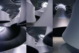 Installation on Space 01: partial views and details of the 6 conic projection spaces (photo by ReD | Research + Design). |
|
|||
 Digital model of the Installation on Space 02: FLUOSoft Script view from top. |
THE NEED FOR AN INTERFACE.
Given that it is art institution that does not possess any private collection, the Kunsthaus is an empty container without walls, corridors or any given circulation. This openness forces each venue to entail a new formal manifestation and a process of dialogue with the container itself: in other words, every show has to be built up from scratch. In past exhibitions, conventional pre-fabricated white walls have been used to create temporary partitions and direct the flux of visitors. Yet, from our point of view, this approach has not proven to be the right strategy to activate the singular spatial conditions of the building. Our initial assumption that the Kunsthaus was not a traditional space, logically suggested a design process that ought to be an inquiry on conventional exhibition layouts. For instance, the 'room' for exhibiting an art work in the Kunsthaus would necessarily be different from the "room" of a conventional museum. A wall would not only be considered as a surface to support a painting, but also as an element that should connect and mediate between all different works, the visitors, and the singular scale, geometry and materiality of the building. Conceptually, this notion of Interface resumes our interest on contextualization, because it triggers ideas of dialogue, respect and connectivity with both the art works (contents) and the building (container). |
|||
| LAYOUT: PROGRAMMATIC STRUCTURE AND DESIGN APPROACH.
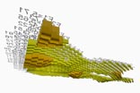
Our comprehension of the programmatic specificities of 'M-city' came along with understanding the potential of its spatial organization. Planned to be the largest exhibition ever at the Kunsthaus, the show would occupy the entrance and all exhibition levels of the building. Celebrating the topic of the "the city", it was a complex event because it included a large set of works (mostly from the art world) that involved a wide range of mediums, sizes and display requirements. In fact, the curators were interested in an exhibition structure where 'the numerous urban processes of change are visible at the centre of the exhibition but also presented in a spatial experience, by means of a multifarious repertoire of artistic forms'. Organized in 6 Thematic Sections (Mapping, No Visions, Migration, Eurosprawl, Landscape and Shopping) and 6 City Portraits (Basel, Graz, Krakow, Ljubljana, Rurhstadt and Trieste), this 'repertoire' would congregate around 30 exhibited personalities (artists, designers, video architects, etc.), some of them acting as sub-curators for specific areas of the exhibition. Purposely set up by the curators, all thematic sections would have equal relevance in terms of the exhibition meaning, despite the number of works they would include. The same occurred with the city portraits: the different projections were all considered equally and ought to be presented as such. 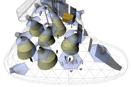 Digital model of the Installation on Space 01: top view. After a long debate on whether or not "themes" and "cities" should be mixed, we took advantage of the building context to develop a conceptual structure. The difference of scale and character between the floors did not facilitate spreading themes and cities everywhere while having a continuous reading of both. Thus, the exhibition got distributed in two major areas (themes below and cities above) with the goal of clarifying the curatorial intentions and align them with the building itself. Moreover, this final layout solution was further supported by the fact that some of the artworks, due to their scale or materiality, could only be displayed in a few selected spots of the building. The architecture of the exhibition would have, therefore, to support this general layout while taking the original features of the context to intensify its spatial possibilities. Given a list of art works that was not determined from the start and, naturally, many factors that could interfere in its final configuration, our design process would need to be flexible; it would have to permit accommodating changes without compromising the overall design solution. In the context of our own professional trajectory, we would continue exploring digital parametric and generative techniques to assist in parallel the design and production of our proposal. This integrative approach would also provide an efficient adaptation to budget fluctuations and strict time constraints, while facilitating a continuous dialogue between us architects, curators, artists, fabricators and construction staff. TOPOGRAPHIES OF NEGOTIATION. With the goal of using the building to develop an installation that activates its context and presents 'M-City', the ceiling -with its matrix of fluorescent lights on the first floor and the nozzles on the second- seemed a very interesting feature to work with. Our concept was to generate a 'response' of that ceiling towards the programmatic layout underneath, by means of controlling the lighting conditions and suggesting a circulation throughout the space. Our intervention would then be the interface to negotiate both, considering aesthetics, functionality and feasibility. |
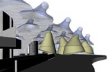 Digital model of the Installation on Space 01: interior view. |
|||
 Digital model of the Installation on Space 02: FLUOSoft Script view from below. |
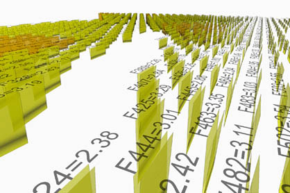 Digital model of the Installation on Space 02: FLUOSoft Script perspective view. |
|||
The difference in the spatial configuration and exhibition program of both floors led to the development of two distinct formal solutions yet still obeying to a common concept. Without interfering in the display of the work itself, both installations 'accompany' the visitor subtlety and suggest ways of navigating through space. They do so by 'floating' above the exhibition floor and 'adjusting' the existing illumination conditions to either lighten or darken the space. ReD's project is thus two-fold: it is virtually present everywhere in the exhibition within the organizational layout of artworks, and physically represented by two architectural installations, which are limited to the ceiling and trigger a playful conversation between the existing neon lights and the artistic world below.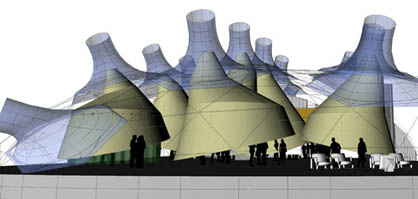 Digital model of the Installation on Space 01: side view. |
|
|||
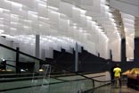
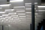
| FIRST FLOOR.
What may appear simplistic at first glance, did hide a much greater potential to be exploited. In the first floor, the excess and repetition of standard fluorescent lights in a monotonous orthogonal grid provided us the minimal infrastructure to generate a completely new spatial effect. By lowering the neon lights at different heights one could transform the absolute flatness of the ceiling into an "inverted topography", which would cover the entire thematic part of the exhibition. By controlling their height variation and relate it to the exhibited works below, they would help suggesting 'areas' and 'circulation paths' without using traditional "walls" or "corridors". Considering that the manual work involved in lowering 587 neon was an impossible task, we decided to invert the situation; leaving all the lights at their original level; we would hang individual soft light covers (Flags) of variable length to diffuse their illumination. |
||||
|
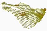
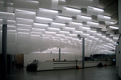 Installation on Space 02: 574 flags hanging from existing fluorescent lights, creating a performance-based inverted topography, view before art installations (photo by ReD | Research + Design). With this objective, many different digital techniques were tested to model this topography. To define it with precision and check several variations, conventional and NURB-based modeling software were discarded for their lack of control in this task. In order to pursue our intentions, we had to design 'a tool to design'; in other words, to develop a custom script –FluoSOFT- that, through the selection of "high" and "low" points, would mathematically calculate their influence on each one of the flags. By progressively adding new features (control points, curvature factors, flattening operations, area calculation, labeling...) FluoSOFT turned into a self-contained environment where design, analysis and fabrication happen simultaneously. Specifically, the software takes each selected light and, by analyzing neighborhood conditions, defines its custom length, builds-up a 3d model and draws a flattened duplicate, with a contour that will be used to guide its CNC fabrication. Given that the program is written to calculate an infinite number of flags of different sizes, it is also prepared to automatically generate an individual label, to be engraved or printed onto each flag during fabrication. |
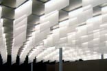 Installation on Space 02: with small size variations, the flags describe a smooth topography over the whole exhibition area (photo by ReD | Research + Design). |
||
 Installation on Space 02: general view on the exhibition opening night (photo by ReD | Research + Design). |
With
all this features built-in-one, FluoSOFT has been a crucial tool for
a project like this. By changing the parameters of the calculation,
one could negotiate: aesthetical decisions (adjusting factors that affect
the smoothness or roughness of the topography), curatorial interests
(by selecting high and low points according to the exhibition layout),
and fabrication requirements (by selecting different modes of flattening
the flags). For any solution we would test, the program would calculate
the required amount of material to fabricate it, which was extremely
useful to deal with budget fluctuations. Similarly, a simple reduction
of the incremental curvature factor would automatically imply decreasing
the total amount of material, thus affecting the overall cost. Despite
the geometric complexity of the resulting topography, this flexibility
allowed us to incorporate changes until the very day of the fabrication
deadline, without ever compromising the initial design intention. All
the flags were cut out with CNC equipment, and made of a white translucent
and extremely lightweight fabric. Both qualities were fundamental in
the material selection; transparency was important to produce a layering
effect that could intensify the existing light repetition, and lightness
for not damaging their tracks. Despite the large number of flags, their
positioning in the space was remarkably simplified by their engraved
labels, while their installation had been engineered as a very simple
attachment onto the neon supporting structure.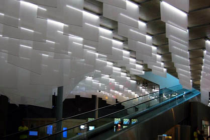 Installation on Space 02: the ceiling topography adapts itself to frame the ramp access to the upper level (photo by ReD | Research + Design). |
|||
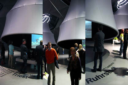
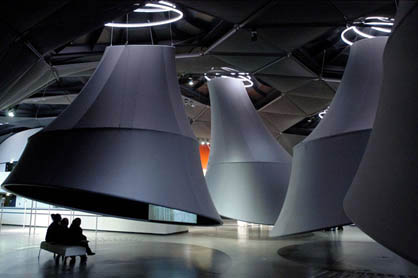
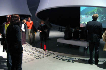
| SECOND
FLOOR INTERVENTION. The second floor installation consists of 6 'projection
environments' to display the different video portraits on the cities
of Basel, Graz, Trieste, RurhStadt, Krakow and Ljubljana. They have
been called 'cones' but metaphorically, these environments can also
be described as a series of 'inverted trumpets' or 'hanging bells',
because they are suspended from the structure of the existing ceiling.
Designed to avoid the conventional definition of rooms with perimeter
walls, they create 6 differentiated, dark and intimate spaces. Given
that these cones come out from inside the existing neon spirals of the
'noozles', their 'interior' space becomes darker, while their exterior
surface reflects the fluorescent light. Without touching the ground,
they are gently tilted to invite the visitors to gather under them,
view the projections and then move from one to the other. In this manner,
the cones provoke the visitor to wonder through an exhibition space
that still maintains its overall continuity. Like in the 1st floor,
this installation tries to avoid any preconceived or linear visiting
trajectory. |
||||
| |
||||
| FINAL
REMARKS. With this design exhibition ReD took the challenge of trying
to develop a proposal that could engage the singular context of the
Kunsthaus Building. As an interface, the intervention negotiates the
programmatic requirements with the spatial environment conditions. Despite
its apparent formal complexity, every detail of the project has a contextual
meaning at those two levels. During all these process, digital technology
was a decisive environment to develop a project that involved a large
number of people, settled in countries from Europe, Asia and America. ReD (Marta Malé-Alemany/Jose Pedro Sousa) |
||||
| NOTES: 1. This text was originally published in: Marco de Michelis, Peter Pakesch (eds.), M Stadt - European Cityscapes, Verlag der Buchhandlung/Walter König, Cologne 2005, pp. 60-69. 2. The M-City Exhibition Design for the Kunsthaus Graz has been designed and developed by ReD principals, Marta Malé-Alemany and José Pedro Sousa. Outside of the regular ReD team, the project has counted with the assistance of University of Pennsylvania student Teddy Slowik and the invaluable help of local architect Niels Jonkhans for the fabrication and installation process. The project has been built by the company Procedes and the construction team of Kunsthaus Graz. ReD principals would like to thank the curators Marco de Michelis and Katrin Bucher for their support, and recognize the immense contribution of many Kunsthaus staff members, without whom the project would not have been possible to realize. |
||||
| Founded
by architects Marta Malé-Alemany and José Pedro Sousa,
ReD | Research + Design is an Architecture and Digital
Fabrication Studio that operates internationally from Barcelona and
Porto, merging Design and Research both in practice and academia. ReD
DESIGN RESEARCH specializes on implementing advanced digital technologies
to link the conception and fabrication of architectural projects. ReD
PROJECTS include urban furniture, interior renovations, large installations,
building design and collaborative developments with architects and fabricators.
ReD WRITINGS reflect the studio’s interest in the interference
of CAD/CAE/CAM technologies in Architecture. ReD WORK has been presented
in several international conferences and architectural publications. Marta Malé-Alemany has taught architectural design in US and European institutions (U.PENN, UCLA, SCI-ARC, ESARQ-UIC, IaaC and other) focusing on the conceptual and material opportunities emerging from the use of parametric design and digital fabrication technologies for the production of Architecture. She is regularly invited for independent lectures and participation in International Conferences on Digital Architecture. José Pedro Sousa is a PhD candidate at IST-UTL with a scholarship from the Portuguese Foundation for Science and Technology (FCT). Investigating the impact of new CAD/CAE/CAM technologies in the use of traditional materials in Architecture, he was a Special Student at MIT and a Visiting Scholar at U.Penn. He has taught at FAUP and ESARQ-UIC and writes regularly for architectural publications. |
||||
|
M Stadt - European Cityscapes |
||||
 |
Kunsthaus Graz, October 1, 2005 to January
8, 2006 |
|||
| >
EXTENDED PLAY: YU-TUNG LIU: THE PHILOSOPHY OF DIGITAL... | ||||
|
|
ARCH'IT
books consiglia: Marco de Michelis, Peter Pakesch (a cura di) "M Stadt - European Cityscapes" Verlag der Buchhandlung/Walter König, 2005 pp384, $39.00 acquista il libro online! |
|||||
| La
sezione Allestimenti laboratorio
|